Note, this is part two of four on how to Critique Your Photos. This four-part photography tips articles series will focus on 10 steps that should help you improve your photography.
10 Steps to Critique Your Photos — Part Two …continued from part one
4. Editorial Value, emotional appeal, does it tell a story are three things to look for when you critique your photos, or critique another photographer’s images. When you study a photo and ask yourself, “Does it tell a story? Does it bring out your emotions? Does it have value to an audience?” Ideally, you’d like a “yes” to at least one of those questions.

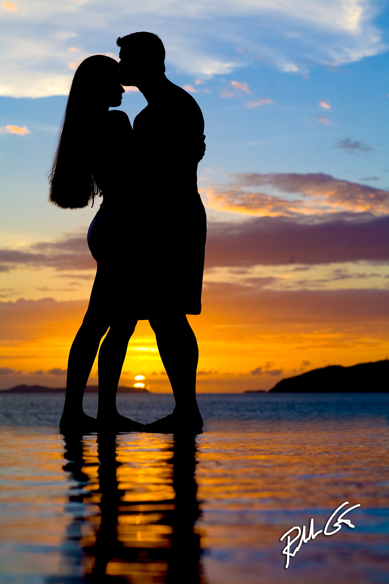
Even with a silhouette can tell a story as seen here.
Editorial value applies more to publication requirements when images are used to illustrate a story. If you’re asked to supply photos to a publication, an editor will normally tell you what they want in an image. If you blog, or want to submit a freelance article for publication, then the photo needs to illustrate your points. You images should tell a story, or help you illustrate the point your words make.
If your photo doesn’t support the article for publication, that doesn’t necessarily mean it’s a bad photo, it’s just not a photo that works good for the article and it might be best to save it for a future article or even better, sell it for stock or use it for your own portfolio promotion.
The next thing to look for is emotional appeal where an image stirs emotions. For example, if you photograph the birth of a newborn, look for the emotional appeal to tell the story of birth like when the parents cut the umbilical cord.
Don’t judge the photo just on your emotions, ask yourself if it will invoke emotions in others too? The most powerful images are those that invoke emotions over a broad spectrum of viewers.
A strong image tells a story. For example, in portraiture you have portraits and then you have environmental portraits. Environmental portraits tell a story of the subject in their environment, usually their profession. Let’s pretend you have to photograph the CEO of an automobile company for their annual report. Simply place the CEO so the assembly line is in the background. This photography technique, where a main element is complimented by a secondary element is known as juxtaposition.
Sometimes it tells the story in a subtle, or implied manner. Take a photo of a female subject as she stands at the bathroom mirror and applies lipstick. Then take the same scenario but make sure in the mirror’s reflection that you can see the doorway with a man’s tie that hangs from the door or door knob. These two photos convey two different messages and latter often makes the viewer feel as though they are there with the subject.
5. Perspective in photography comes in various forms, from camera angle of view to camera distance. Both impact what the camera captures, which is sometimes different than what we see through human perception. In technical talk, perspective is defined as the spatial relationship between objects plus their size in respect to the point of view from the camera that the viewer sees.
Because perspective is easily affected by many things including human perception, this is one reason the U.S. government requires the statement, “objects in the mirror are closer than they appear” be engraved in “wing” mirrors on all motor vehicles. This phenomenon occurs because of the mirror’s convexity that makes objects appear smaller in the given field of view, and if we’re not careful, human perception of “things that are smaller” is that objects are farther away, but they are not.

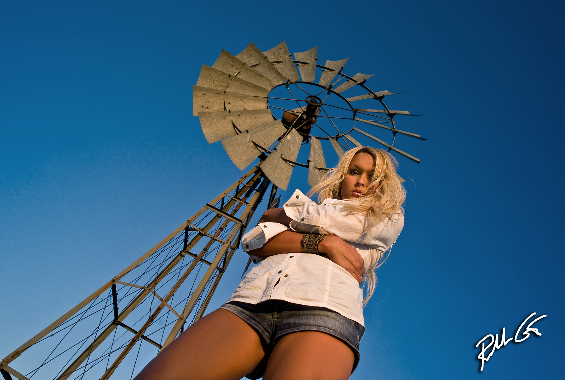
Perspective changes with lens length as well as angle as in this photo captured at one of my Moab photography workshops.
So, when you critique your photos take human perception into account and ask the questions, could the perspective have been better? Does the perspective work for the subject matter? Does the perspective provide the best point of view? Does the perspective help tell the story? Does the perspective distort the truth?
Notice we didn’t mention anything about camera lenses. When you change a camera lenses from a wide-angle lens to a telephoto, perspective doesn’t change if the camera distance and position to the scene or subject stays the same. This switch of camera lenses only changes background compression and depth of field from the actual focus point plus the “angle of view.” Sometimes you might see a change in the superficial or apparent viewpoint when you change lenses, but there is no change in the real or actual viewpoint unless you change camera distance to the subject or scene after you change the lens.
If you stand 15-feet from your portrait subject, the size of their nose stays the same whether it’s a telephoto lens or wide-angle lens when camera position and distance doesn’t change. However, if you want to capture the same facial area in your view frame from what you saw in your telephoto lens with a wide-angle lens, then you have to move forward, or closer to your subject and this will cause perspective distortion resulting in a larger nose for your subject. Hence why selfies suck most of the time when captured with smart phones.

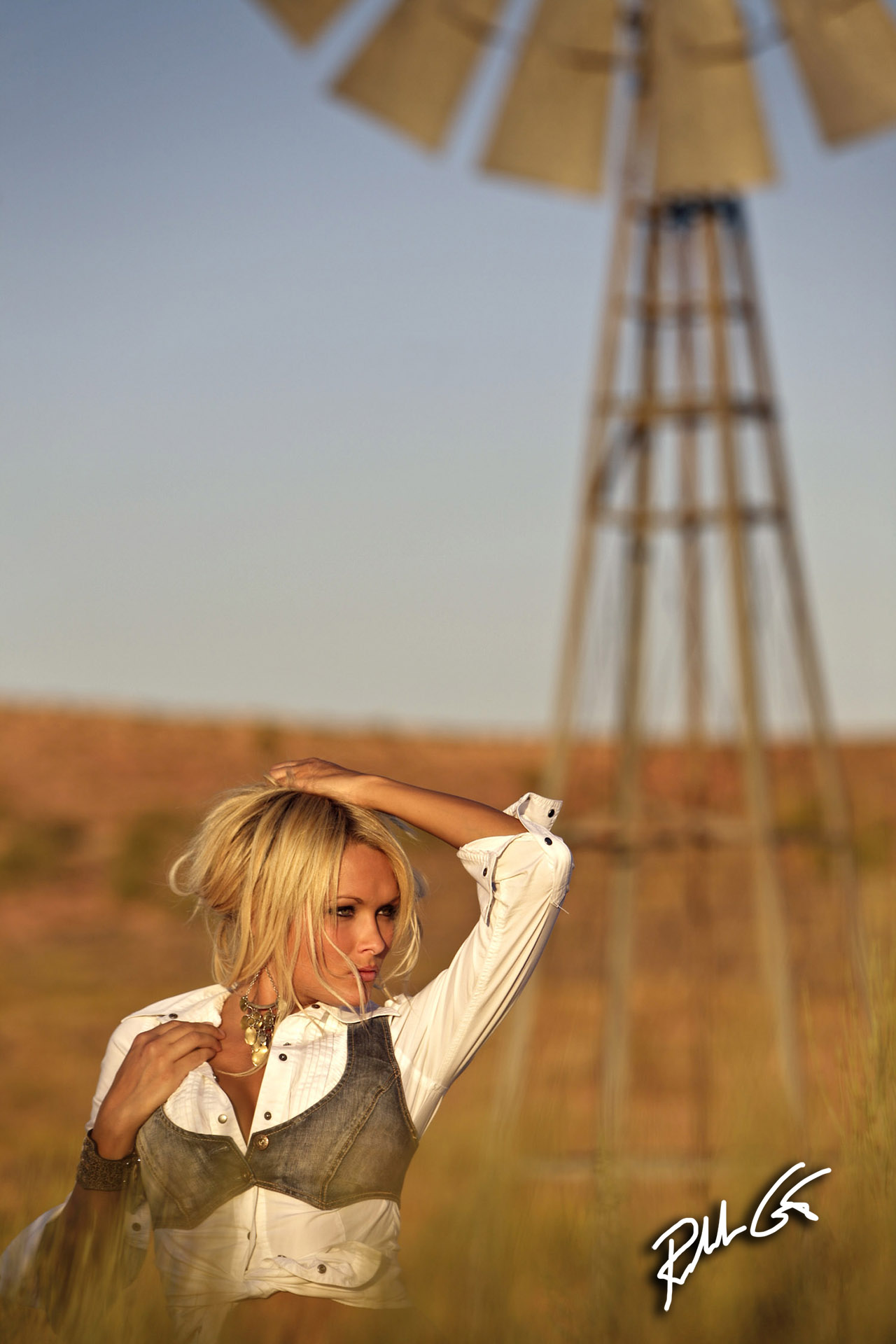
Here is another perspective from the same photo shoot in the Moab.
Professional photographers understand lens perspective and distortion and experienced portrait photographers prefer medium-telephoto to telephoto lenses in the range of 85mm to 135mm in 35mm camera formats. Whether you use a full-frame or crop-sensor, DSLR or mirrorless cameras, the effective focal length for the best perceptional view of an image when it comes to portraits in 35mm formats is the 85mm to 135mm range.
Some mirrorless systems, specifically the four-thirds systems, have a 75mm lens that becomes an effective 150mm lens. This is an ideal lens for portraits. Longer focal lengths give a more flattering perspective to your subject. You’ll often hear professional photographers claim that portrait lenses do not add weight to their subject like that of a normal 50mm or wide-angle lens.
In addition to perspective distortion from lens to subject distance, you also have foreground and background perspective changes simply by positioning yourself and camera at different height levels. If you place your camera down low this allows you to put more focus on the foreground and when you photograph people, this perspective will make their legs look long and their body look thinner. The opposite happens from a higher camera perspective to your subject, their legs will appear shorter and the body will appear thicker. Use this knowledge to make tall subjects shorter and short subjects taller.
Basically, when you raise or lower your camera you break from typical eye-level views. Your photographs become better, but you must walk around your subject too. Great photojournalists know this technique — move around and look for the best angle of view for your subject while at the same time, look for the best background.
In juxtaposition, a photojournalist tries to add a second element in the frame to help tell the story or sometimes just to add something funny or even serious. This second element normally compliments the main subject.
Note, this is part two of a four-part photography tip article series on how to Critique Your Photos. Now let’s continue to take your photography to the next level and go to part three.


