
Note, this is part three of four on how to Critique Your Photos. This four-part photography tips articles series will focus on 10 steps that should help you improve your photography.
10 Steps to Critique Your Photos—Part Three …continued from part two
Background, middle ground and foreground in photography makes a difference in the strength of a photo because photography in form is not physically three-dimensional. However, with various photography techniques we can create the illusion of the third-dimension in our photos to simulate what the human eyes see and perceive.

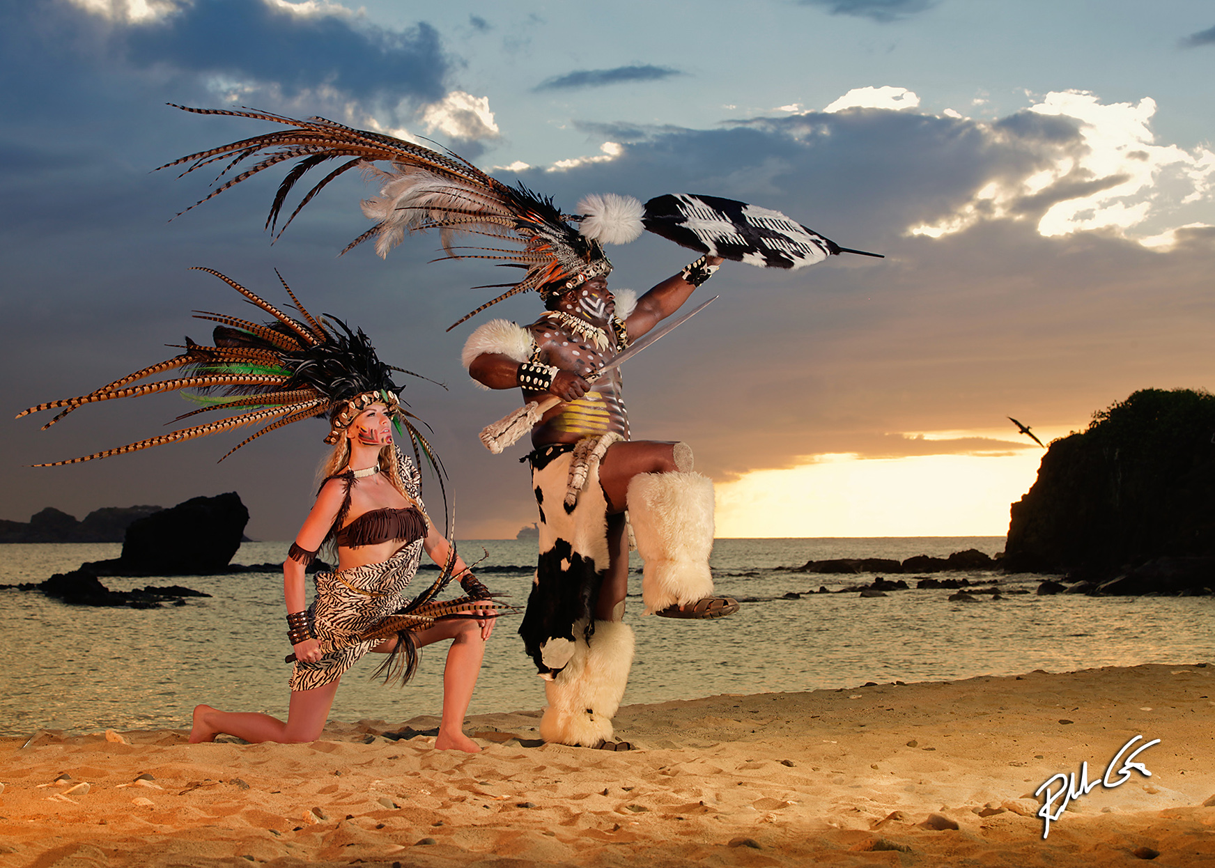
In this photo, notice how the placement of the horizon line emphasizes the importance of the background.
One of these photography techniques is to observe the “grounds.” The background, middle ground, and the foreground in the scene we will capture with our cameras. Backgrounds are probably the easiest, especially if you’re a landscape photographer. We can throw the background out of focus, which is an aesthetic way to remove it through the minimization of the depth of field. Simply use a long lens and select a wide aperture, or we increase the aperture and use a wide-angle lens to insure the background remains sharp.
When the background is the main focus, like in a photo of a mountainous snow-capped region, you can create the illusion of depth when you place another element in the foreground, perhaps a young couple, a horse, a lone tree, etc., and it’s this second element of interest, or juxtaposition, that helps create the illusion of depth of field and a third-dimensional effect.
For a more reinforced look of a third-dimensional quality, find the perspective that displays the snow-capped mountains in the background, or your horse or human in the foreground, or perhaps a lake, old barn, or even some interesting trees in the middle ground. This makes an image more powerful than capturing a single element. Something as simple as a field of flowers or wheat that moves with the wind in your middle ground will add more power to an image.
Keep in mind, the more elements you add to a photograph, artificially or naturally, the busier your photo becomes, so normally it’s best to keep each additional element simple as you try to tell a story by some form of interconnection. As an example, a nice snow-capped mountain in the background, a small lake in the middle ground, and an individual carrying a fishing pole headed toward the lake. That’s a story as well as a photograph with a perceived third-dimensional quality.
The grounds are also affected by the camera lens position. If you capture a lower perspective with your camera, you can place more emphasis on the foreground and a higher perspective will put more emphasis on the background. One thing to keep in mind is the placement of the horizon line as you make a low to high, or high to low camera position adjustment.
From a perspective standpoint, place the horizon line on the lower third of the frame to put more emphasis on the sky which is great if you have something in the sky like dramatic clouds or an airplane. Place the horizon line higher, at the upper third of the image frame, if you want more emphasis on the middle and foregrounds.
When you critique your photos, ask yourself, where is the importance in the photo? If important element in the photo is the subject, you would normally place them in the middle ground, but ensure that the foreground and background do not take away from your subject and if either are also emphasized in the image, they have to add some type of impact.
Why is this good, why is this bad? What can make it better? These are three questions practically every photo editor asks when they decide on photos for publication. Every photographer should ask themselves these three questions when you critique your photos while photo editing. If you can properly answer them, it will help improve your photography plus teach you how to “see” when you’re on location.
Take a systematic approach with these three questions. Look for the obvious answers first, then once those answers are noted, look at the small things next. Make mental notes of what works in the photo and what doesn’t work. Then ask yourself how, if you could recreate the photo again, can you improve upon it, or if you can’t reshoot it again, how you can use what you’ve learned to improve future photos? Take the military approach, an AAR, or an After-Action Review. Analyze, analyze, analyze, then take action. It works!
In this photo the beach is the foreground, the ocean the middle ground, and the sky the background. Notice the placement of the horizon line.
Contrast, when you critique a photo, is looked at in two forms, tonal range and color contrast. Tonal range in a final photo is the direct result of the dynamic range of the digital camera sensors. The tone in an image is impacted by the light that strikes it when the scene is captured. Basically, it’s the total amount of shades of color, or in black and white, the shades of gray, that is captured, viewed, and printed.
The tonal range limits, i.e., the darkest shadows and the brightest highlights possible in your final photograph, is limited by the “EV,” or exposure value, of your camera’s sensors. Camera sensors with a high EV rating allow for a greater dynamic range. The dynamic range is the digital latitude expressed in the photo’s histogram, while the tonal range is the analog print’s latitude expressed with monitors, printers, inks, and papers.
A higher tonal range means higher contrast plus defined detail in an image, and it’s this contrast of the various shades in an image that can draw attention to your subject. While high contrast can make an image appear sharper, low contrast images can appear more of a solid color and with less defined detail. In general, higher tonal range images are considered higher quality photos by photo editors.
In color, a higher tonal range works well with color contrasts, or the use of two opposite colors to bring attention to the subject, specifically a warm color vs. a cool color. Think of a girl in a yellow bikini and the background is a beautiful blue ocean. Change the bikini to blue, green, or even cyan, and generally you have a low tonal range. Colors that “pop” can add the illusion of another dimension, and this is important when you attempt to create the illusion of depth in a non-three-dimensional medium like photography.
Note, this is part three of a four-part photography tip article series on how to Critique Your Photos. Now let’s continue to take your photography to the next level and go to part four.