
Adobe Photoshop Tip for True Color. Adobe Photoshop has come a long way since its exclusive introduction for Apple Macintosh computers by Adobe Systems in 1990. Its origin actually dates back to 1987 when Thomas Knoll, “a PhD student at the University of Michigan, began writing the program so he could display grayscale images on his monochrome display.” Since then, Adobe Photoshop has undergone major version upgrades and it’s utilized on many millions of computers with color monitor displays for business and consumer use worldwide.
Unfortunately, though many users fail to get the full-color benefit that Adobe Photoshop offers, even those practicing some form of color management, because of their cluttered computer wallpaper backgrounds when editing photos and in this article, I’ll prove to you how perceptions affect our eyes in when working in Adobe Photoshop, or any photo imaging program. This is a common problem even with some professional photographers and many blame it on poor color management when a simple keystroke can solve their color interpretation problems with photos.
Unlike the monochrome days of computer displays where desktop backgrounds were virtually non-existent, today a computer desktop background is usually a favorite scene chosen from the default selections of our computers, or a scene captured by ourselves that usually features our loved ones or a favorite vacation photo. Most of these computer desktop backgrounds are filled with brilliant colors projected through color monitors capable of producing millions of colors, hues, shades and superb saturations — all affecting how we perceive a photo on our computer, especially during the postproduction workflow.
For the most part, there are two types of photographers when it comes to postproduction, the diehard color management professional that fills their entire screen with the photo they’re editing that leave room only for the working window pallets and tool selector menu. The other photographers are those that don’t utilize their entire desktop workspace and allow plenty of their background wallpaper to surround their postproduction photo, thus throwing off to some degree their perception of color. Don’t despair, here’s the simple workaround to prevent that, just use the “F” key function (not the keyboard function keys, just the character “F” key) when working in Adobe Photoshop.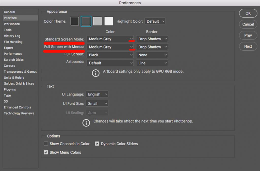
But first, go to your Adobe Photoshop menu, Photoshop >> Preferences >> Interface, and make sure that under “Standard Screen Mode” and “Full Screen Mode,” you have selected “medium grey.” This medium grey is more representative to the common 18% gray standard used in photographic light meters and gray is neutral in general.
Merely pushing the F key on your computer keyboard will instantly change your desktop background to a neutral medium gray, if you followed the preferences changes, then when you strike the F key again and it now goes to a neutral black desktop. Don’t panic though, simply strike the F key again while in Adobe Photoshop and you’ll find your background will reset to the original wallpaper. Obviously if you close Adobe Photoshop it will also return your desktop back to its original background again.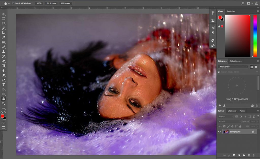
The reason behind using the F key function in Adobe Photoshop is simple, the human eye and brain “perceive” color based on surrounding colors in your work area — even from the walls in your computer work area, not just the computer desktop. But for this article we’ll focus on your computer monitor as it’s the immediate area where your eyes are focused during postproduction.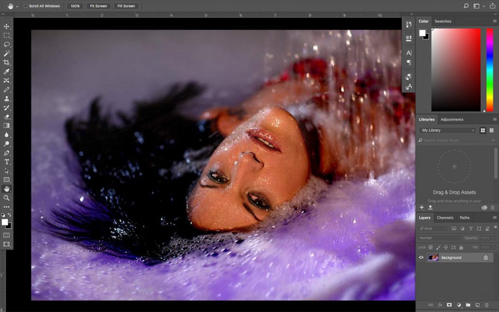
Basically, if you have a dark color around your main photo, your photo will appear lighter and if you have a light color around the photo you’re editing, it will appear darker. This is one reason why professional photographers match the tone in their finished print to the matte if their photos are framed for display. Colors are decoded differently in our brains when surrounded by other dominant colors.
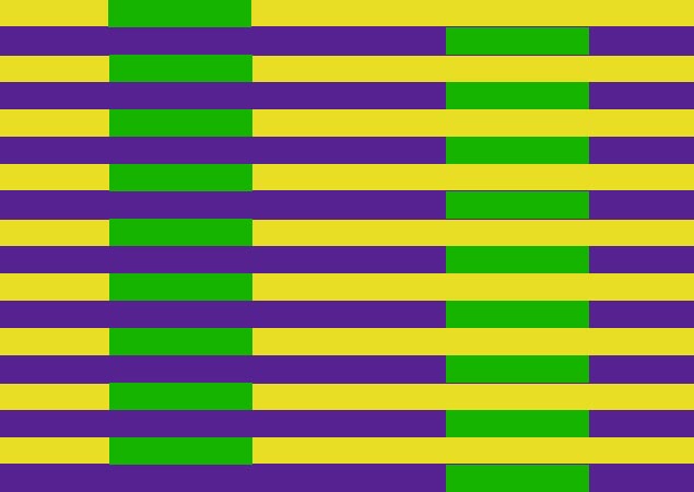
Is the green blocks on the left darker than the ones on the right? They are both equal.
As an example, look at the image above. We see two vertical rows of green surrounded between yellow and magenta and though none of the green rows are connected, our eyes will perceive the green rows on the left darker than the green rows on the right — in this environment our eyes together with our brain perceive that the green on the right is a lighter shade than the green on the left.
Though this appears correct, all the green rows in the entire image are identical shades of green — download the image and view the color values with the densitometer tool in Adobe Photoshop and you’ll see they are identical. The same goes for the image below, all rows and columns of green are identical, but our eyes see one thing and our brain perceives another — our visual sensory is tricked.
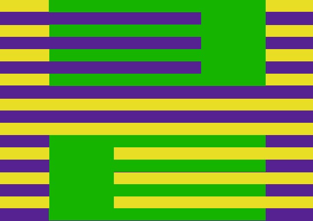
All the green areas in this image are the same color, but do you see that or a difference in green?
During my postproduction of photos in Adobe Photoshop, my preference is using the F key function in the medium gray mode. The ideal neutral gray is known in the industry as Munsell gray, usually ranked as N5 through N7, however I don’t recommend changing the color of your computer room walls unless you’re working in a professional prepress environment as our monitors today are much larger than the monochrome monitors of the past.

All areas of green are equal in color values.
The F key function makes photo postproduction more accurate and when combined with the “tab” key, even more accurate and less distracting. Basically, strike the tab key while working in Adobe Photoshop so the tool bars and pallet windows temporarily disappear. Simply striking the tab key again, they will reappear, just like circulating through the F key, so you can always return back to your original workspace environment.
Adobe Photoshop introduced color management with version 5.0 back in May 1998. Professional photographers, publishers and photo printing labs rely on color management for predictable color results, regardless of the user’s computer display. [/callout]
While John Knoll eventually convinced his brother Thomas to turn his original “Display” program for monochrome monitors into the what would later become “Image Pro,” then evolve into Adobe Photoshop, one of the original concepts then is still the same now, correctly displaying images on a computer monitor. Though as photographers, without utilizing the F key function during postproduction, chances are, we’re not really seeing the true colors we captured so I highly recommend you give it a try, especially with images where correct color is critical.